PAUL
CATALANO
Family & Recovery Services NYC
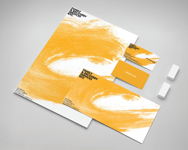
Family & Recovery Services NYC was a new psychotherapy practice that needed a look to match their young, positive style. They wanted something hopeful that would appeal to a broad audience, but at the same time, speak to a younger, disaffected audience, which makes up a large part of their clientele. After doing copies amounts of research, I decided I wanted to avoid the cliches of psychotherapy branding (evocative illustration; a bird with a leaf in its mouth, etc). But I still wanted to promote a positive image in the branding. I was able to create an "orange wave" that was circling back. I felt the image gave a feeling of return, of restoring yourself to yourself. I chose orange for the bright, sunny connotation and applied it to the wave. Lastly I chose a sturdy, solid font for the name mark itself. The client was very happy with the branding.